I wish there was a dashboard that we all could look at that would actually tell us where America, or any country for that matter, stood on a variety of indicators at any given moment. That way it would be real easy to actually see how things are going on a large scale in our country. For my viewing pleasure, and I hope yours as well, here is a snapshot of what I would include. I’m not tech savvy enough to figure out how to embed all of these graphs into this page so that they update automatically. If someone out there can tell me how to do that, I’d be very grateful.
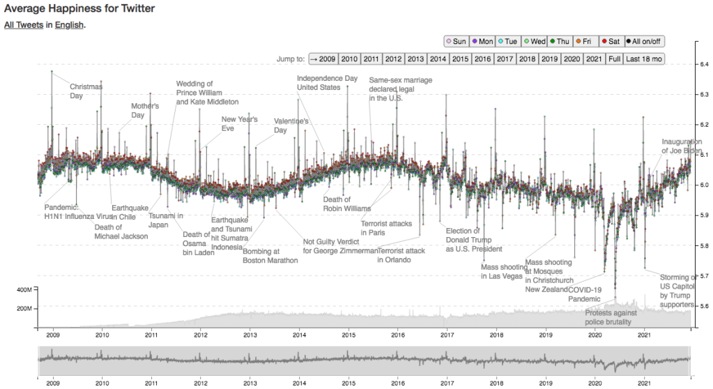
Above is the Average Happiness for Twitter, courtesy of hedonometer.org. This graph starts at the very beginning of Twitter, from 2009. Below is the same graph, but for the last 18 months. You can see that the happiness being expressed on twitter has a steady climb upwards in the last 18 months. I like how helpful these folks are, that they have put notable events on the graph as well. It’s also notable that we’re currently getting back up to the happiness levels that we were at pre-Trump.

Below is the Happiness Index for the United States. This data came from the World Happiness Report, but was plotted by TheGlobalEconomy.com. Most of the rest of the graphs on this post are going to be from TheGlobalEconomy.com, so I’ll only put the source if the graph isn’t from there.
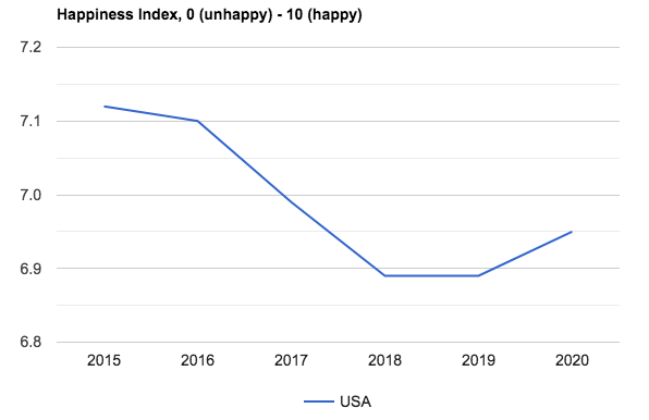
Not the sexiest looking graph in the world, but we don’t make graphs to score sexy points! I should point out, that this is the page I’m using at TheGlobalEconomy.com to make these fine graphs.
Next is GDP per capita. That little dip at the end there is the dip from 2019 to 2020.

Next is the Labor Force Participation Rate. I haven’t read a lot about why this could be happening, I’d love to see some explanations. Here is a definition of Labor Force Participation Rate, from bls.gov “The labor force participation rate is the percentage of the civilian noninstitutional population 16 years and older that is working or actively looking for work. It is an important labor market measure because it represents the relative amount of labor resources available for the production of goods and services.”
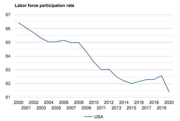
For added context, I’m going to go back to the very beginning of this statistic being tracked on TheGlobalEconomy.com – 1990. You’ll see in 1990 that we had not hit the highest known peak yet, which we reached in 2000. We’ve been on our way down ever since.

Now to the unemployment rate, which is drastically different. This chart came directly from Google. According to the Connecticut Department of Labor, “In simple terms, the unemployment rate for any area is the number of area residents without a job and looking for work divided by the total number of area residents in the labor force.” It’s very interesting to me that the Labor Force Participation rate has been on such a steady decline since 2000, while the unemployment rate has fluctuated so drastically in the last 20 years. Could that be explained by the mass retirement of the baby boomer generation?

Here’s one that I would think would validate the experience of most Americans. The Government Effectiveness Index from the World Bank. Here is there definition: The index of Government Effectiveness captures perceptions of the quality of public services, the quality of the civil service and the degree of its independence from political pressures, the quality of policy formulation and implementation, and the credibility of the government’s commitment to such policies.

The Control of Corruption Index, again from the World Bank. Definition: The index for Control of Corruption captures perceptions of the extent to which public power is exercised for private gain, including both petty and grand forms of corruption, as well as capture of the state by elites and private interests.

The Voice and Accountability Index is also a notable one, again from the World Bank. Definition: The index for Voice and Accountability captures perceptions of the extent to which the citizens are able to participate in selecting their government, as well as freedom of expression, freedom of association, and a free media.

I was wondering why the downward trends on the last three graphs all seemed to start in 2004-2005, then I saw this graph. It’s the Political Stability Index from the World Bank. What the heck was going on in 2004? I don’t remember things being so crazy here then. Definition: The index of Political Stability and Absence of Violence/Terrorism measures perceptions of the likelihood that the government will be destabilized or overthrown by unconstitutional or violent means, including politically-motivated violence and terrorism. The index is an average of several other indexes from the Economist Intelligence Unit, the World Economic Forum, and the Political Risk Services, among others.

Below is the Maternal mortality rate, from UNICEF. I don’t know why we don’t have data after 2017. You can see that 2018 had a rate of 17.4 and 2019 had a rate 0f 20.1 if you go to the CDC. The rates for those years for Non-Hispanic Black people are eye popping. Like double.

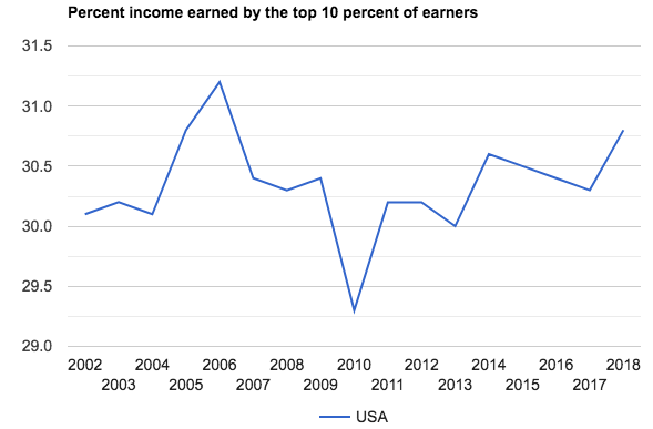
Interestingly, the Percent Income Earned by the Top 10 Percent of Earners – published by the World Bank, does not seem crazy. Or maybe it is, and I’m just used to it?
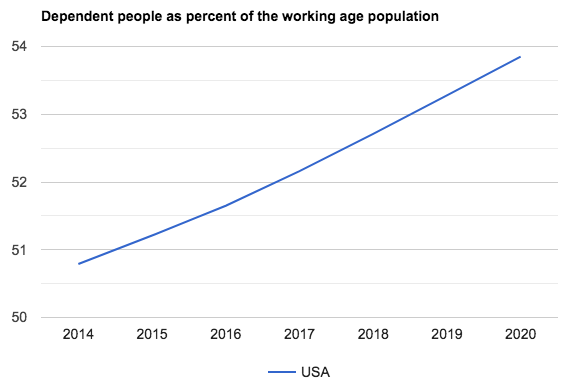
The World Bank also has Dependent People as Percent of the Working Age Population. So all of us who are working have more dependents, apparently. Definition: Age dependency ratio is the ratio of dependents–people younger than 15 or older than 64–to the working-age population–those ages 15-64. Data are shown as the proportion of dependents per 100 working-age population.
Life Expectancy will be interesting to look at once the COVID years are included.

Here’s the birth rate, births per 1000 people.

Here’s the Suicide Mortality Rate, from the World Health Organization.

Hospital Beds have been in a steady decline, per OECD. Why we don’t have data after 2017 is curious, however.

Finally, a graph that isn’t going the wrong direction! Below is Doctors per 1000 people from OECD.

Funny enough, when it comes to crime we start to get data that looks good. First is the Robbery Rate. This is from Statista.

Apparently our imprisonment rate is going down… Though I have seen other sources that have the same overall curve but with higher numbers.

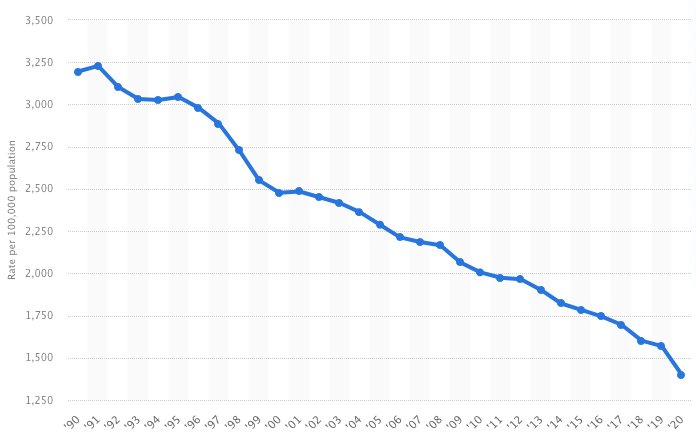
As is our theft rate. This is from Statista as well.
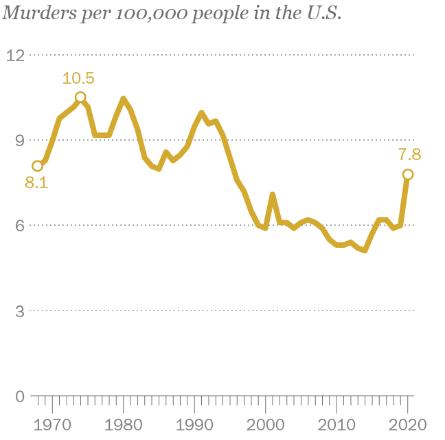
Our homicide rate is interesting. It looks like it started to go up in 2015 or so. This graph is from Pew. Interestingly, 2015-2016 is when our indicators for happiness at the top of this page started to go down. Pew wants us to note that the 2020 data is provisional, and that the data came from the CDC.
This is the estimated homelessness rate, I found it on Statista as well. Though it looks like it originally came from HUD. As someone who works with people who are homeless, I should tell you that these numbers are rough estimates at best.

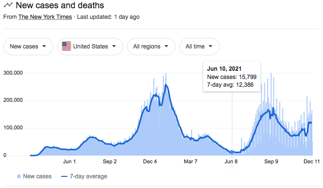
Finally, how’s COVID going? Here is the chart Google provides.
What are my takeaways from all of this data? I’ll break it down.
What’s trending poorly?
-Happiness, but it is beginning to rebound
-Labor Force Participation Rate
-Government Effectiveness
-Control of Corruption
-Voice and Accountability
-Political Stability
-Maternal Mortality
-Our amount of dependents
-Birth Rate (or is this bad?)
-Suicide Rate
-Hospital Beds
-Homicide Rate
-COVID (we’re now in a true second wave)
What’s steady?
-Unemployment
-Percent of Income Earned by Top 10 Percent of Earners
-Homelessness
What’s trending well?
-GDP
-Life Expectancy
-Doctor Rate
-Robbery Rate
-Prisoner Rate
-Theft Rate
Overall, not good. One’s ability to be employed and avoid being the victim of property crime is trending well. But all of the indicators that are about quality of life look bad, and most of them have looked bad for a while. It’s no wonder that over the last few years some people have said that America is in decline. In some notable ways, it is. I’m tempted to link the sudden spike in our murder rate to a general feeling in our culture that there is a lack of trust and support – as illustrated by the other poorly trending indicators I have here… but that truly is just an opinion. I lean that way because there has been no corresponding spike in property crime – so the desperation that we think leads to property crime doesn’t seem to carry over to homicide.
I’m going to leave this here, all under the American Well Being category on this site. I expect I’ll only do updates once a year or so to this category, but it should continue to be easy to find when you come to my website. A big part of why I wanted to make this is so I could reference it when I need it – now it is here for you too.
Here’s some stuff for me to reference for the next blog I do on this topic: https://www.countyhealthrankings.org/health-data
